Working with a leading pharmaceutical company who are dedicated to treating patients worldwide. The task was to transform an outdated and static presentation into an engaging and interactive iPad app. The sales tool is used to promote a drug treatment for AML and MDS. In total, four presentations were designed.
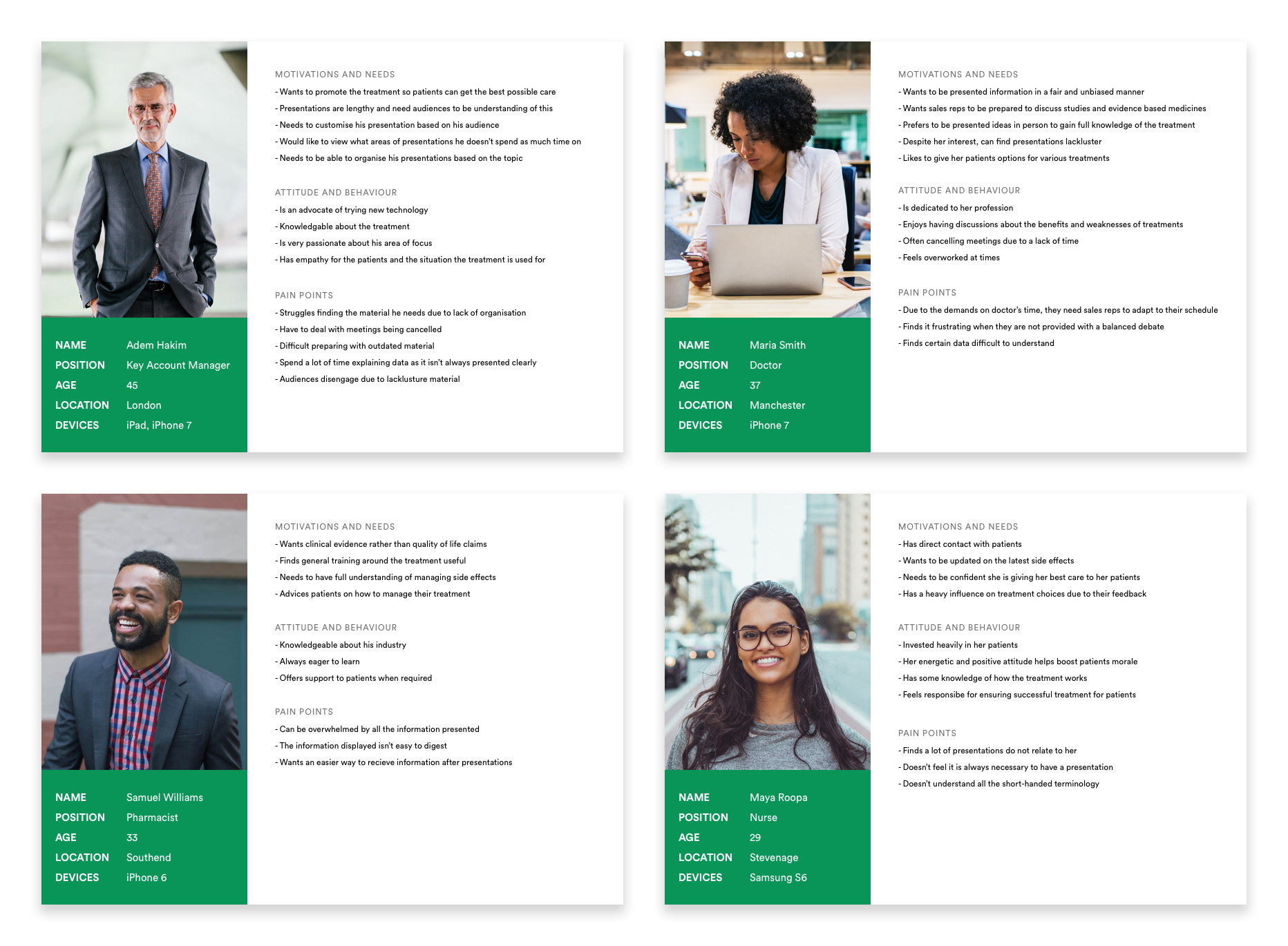
There are four user types to consider all of which have different needs to be addressed from the sales tool.
Key Account Managers (KAMS)There are 8 KAMs who will be conducting all presentations and will be exposed to the tool the most. KAMs are expected to know all of the content off by heart and would have an induction on how to use the tool and all of its capabilities. It is vital they can run through presentations efficiently to keep their audience engaged at all times. Navigation through a PDF can be messy as it can be difficult to find certain sections of the presentation that they require.
CliniciansClinicians need to convey the severity of a disease to a patient, therefore, they need to know the benefits the drug has to offer, how it works and any possible side effects they may receive.
PharmacistsAs a supplier of the drug, pharmacists will require generic training on how the drug is used. They will also need to know how to treat side effects.
NursesAs they have direct contact with the patients, they will need to know how to perform the procedure and the maintenance around the drug. It is important that they know how to discover a side effect and understand how to manage it. They will also need to be on top of administration and assist patients by keeping them on the programme..
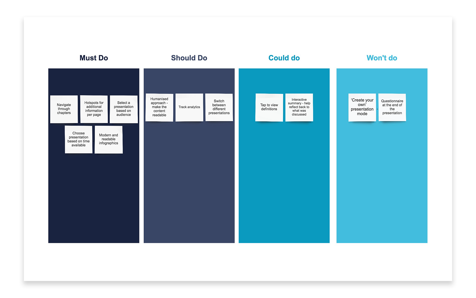
There were a lot of ideas and different approaches that were considered in order to design the app. After completing a MoSCoW analysis, this helped prioritise key features which were then used to create high-fidelity wireframes as I had content available.
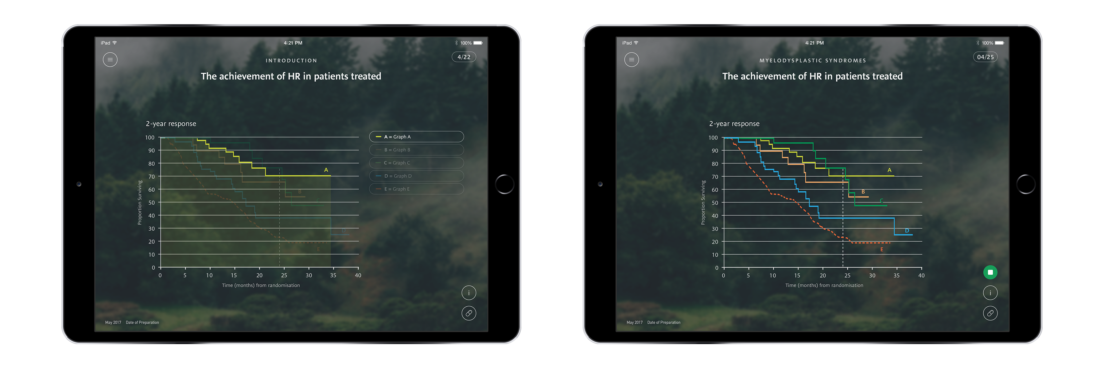
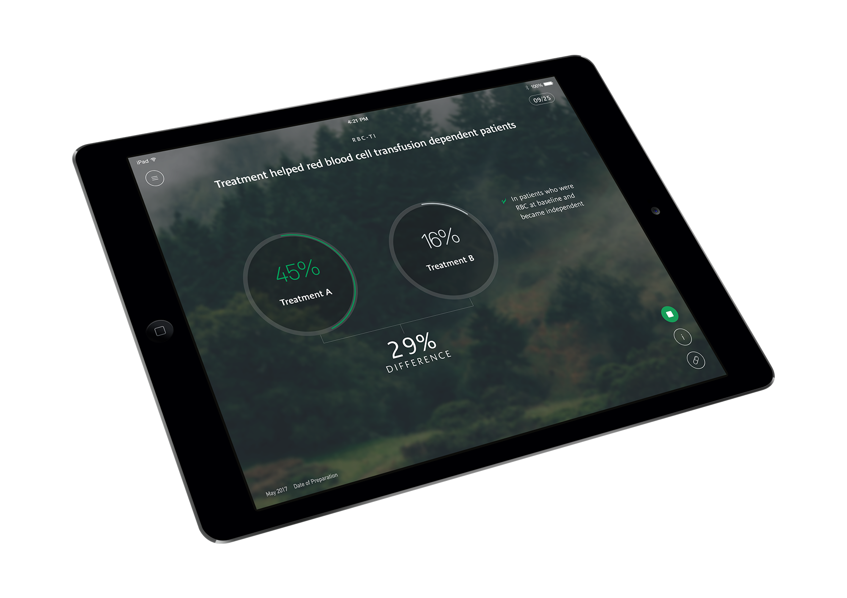
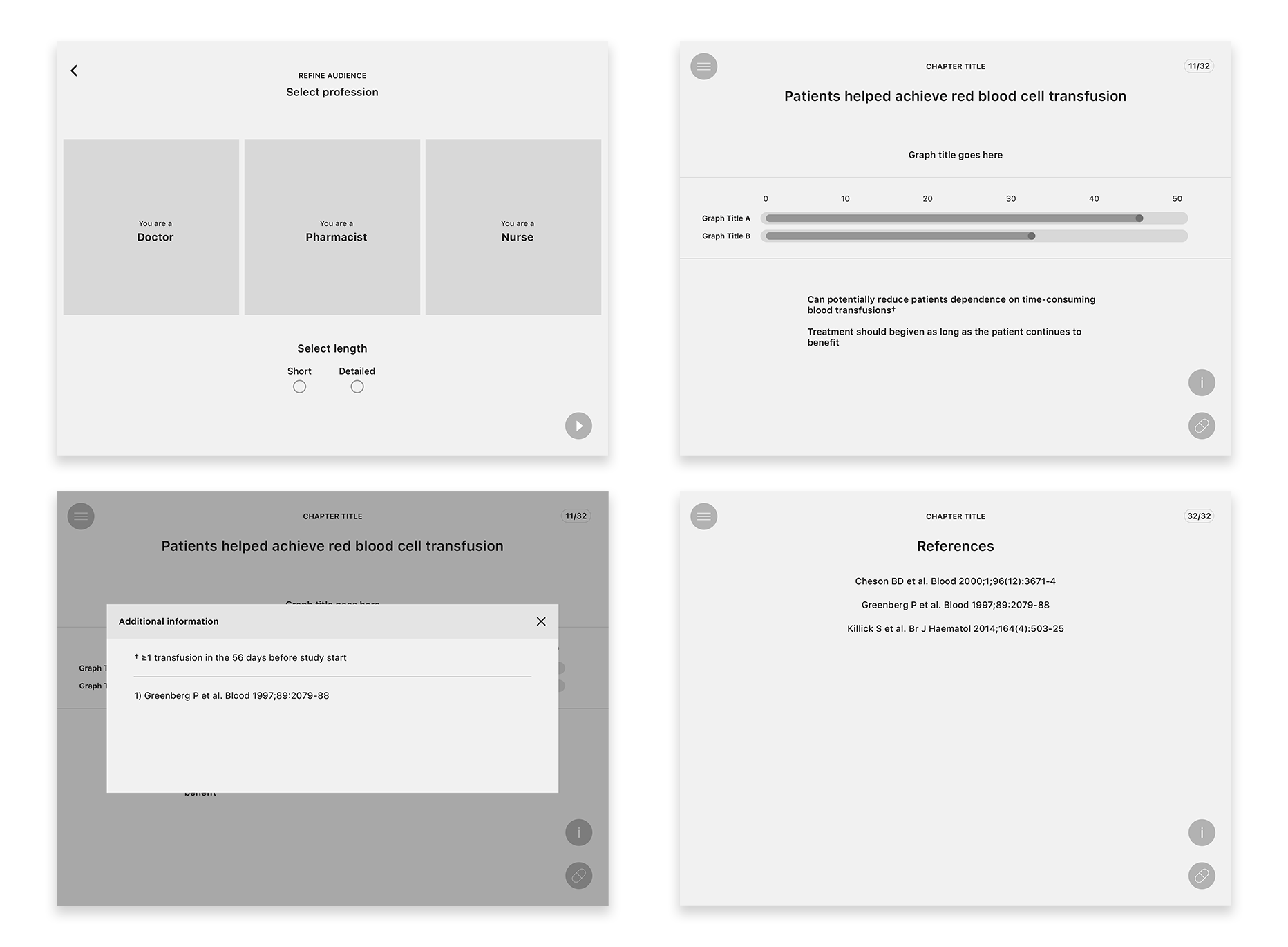
One piece of functionality that would be included was the ability to create hotspots. This would help hide content which did not need to be displayed thus creating a cleaner presentation. A lot of the data displayed was difficult to read which lead to the creative freedom of redefining how infographics were displayed and interpreted.
Key screens were created as wireframes which helped setup an overall structure of how the app would work. This process was invaluable as I had real content to use and bring the wireframes to life.
The app must be submitted through a system called Zinc which is an approval system for all of the content. Pharmaceutical companies must abide by set laws, some of which are open to interpretation. One of the rules states that you cannot be biased towards a product. This meant careful consideration was put into the designs to avoid this from happening.
One approach used was to implement bullet points instead of numbers when displaying a list. The term ‘versus’ was also considered to show favouritism and was also avoided.
Initial designs were created based off the wireframes and the presentations provided. Some rules were set up to create consistency within the designs, for example, bar graphs were redesigned to create a new pattern and were to be used for all bar graph designs going forward.
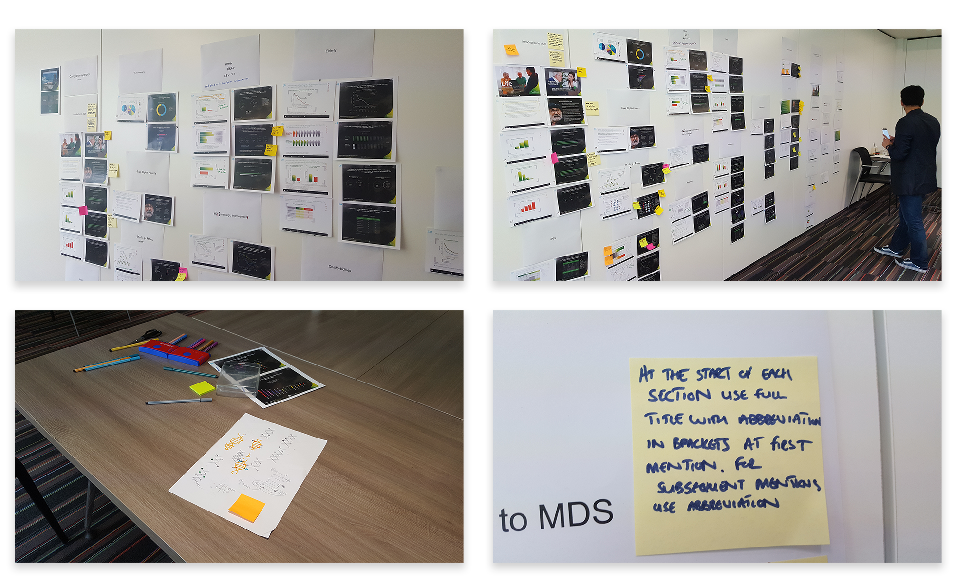
A one day workshop was setup with some of the KAMs. To conduct the workshop, I printed out all of the designs and placed them onto a wall where we encouraged KAMs to leave sticky notes on areas where they had queries. There was also an iPad available to view all the designs on. During this workshop, there were two outcomes I aimed to achieve.
Firstly, I wanted KAMs to review all the content and how data was to be displayed. This was effective as it allowed KAMs to discuss their thoughts on the content and whether they felt it needed to be rewritten. They would also discuss how they interpreted the infographics and how they would each present this to an audience.
Secondly, to help create a clean navigation, I suggested pages should be categorised by chapters which the KAMs also felt would help create a better structure. At the end of the workshop, KAMs felt this was a valuable task as it felt as if they were involved in the design process and helping to recreate the flow of all the presentations.
After absorbing this information and speaking with the KAMs this helped me understand how they would conduct a presentation.
An example of this was adding a key to a line graph where the user could toggle to view each line in more detail. The response to this feature was ‘I wouldn’t use that’. From an outside perspective, this seemed a useful feature as they may want to delve into the graph in detail but this was not the case.
A new feature was introduced which allowed users to be able to track analytics. This would help KAMs understand which areas of the presentation they were spending too much or too little time on thus helping KAMs deliver a better presentation. Introducing this feature would also indicate whether there are common trends between certain slides which would need to be modified due to the content or the design.
The buttons were displayed on every page so users could start and end presentations quickly and efficiently with one tap. This would help prevent users from forgetting to do so.