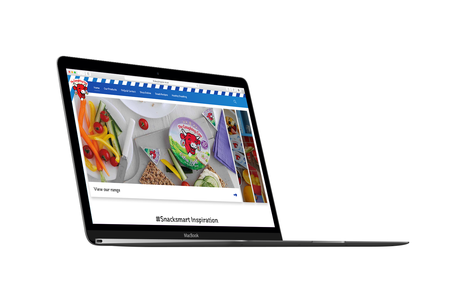
A leading renowned brand, The Laughing Cow wanted to own “snacking moments” with a large budget for media & advertising. With the website receiving traffic but having a high drop off my role was to improve the website by making it inspiring and engaging. Whilst working on this project, The Laughing Cow Redesign won a WebAward in 2018.
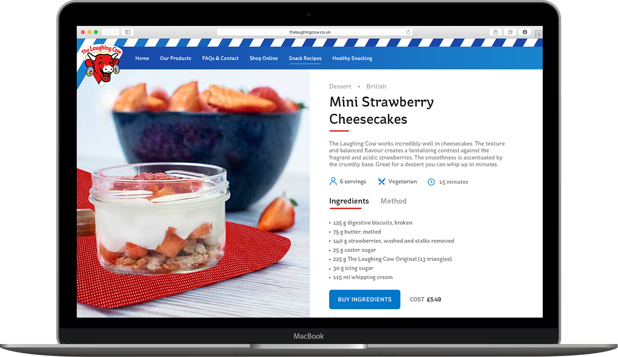
One of the essential pages of the website was the promotion of snack recipes. The goal was to entice users to be more adventurous by using their innovative recipes.
The response was to promote features so users had a better understanding about the recipes. This would also be used as a filtering system so users could find recipes that they would be interested in and making it feel more personal to them.
Some of the features used were occasion, dietary & health requirements and cuisine. Icons were used with these features to attract visual attention and make the website easily scannable.
The recipe image was used to split the page into two sections. As the meal is the focal point this needs to be kept in the users sight. When the user scrolls the image is fixed whilst the content is the only moving object.
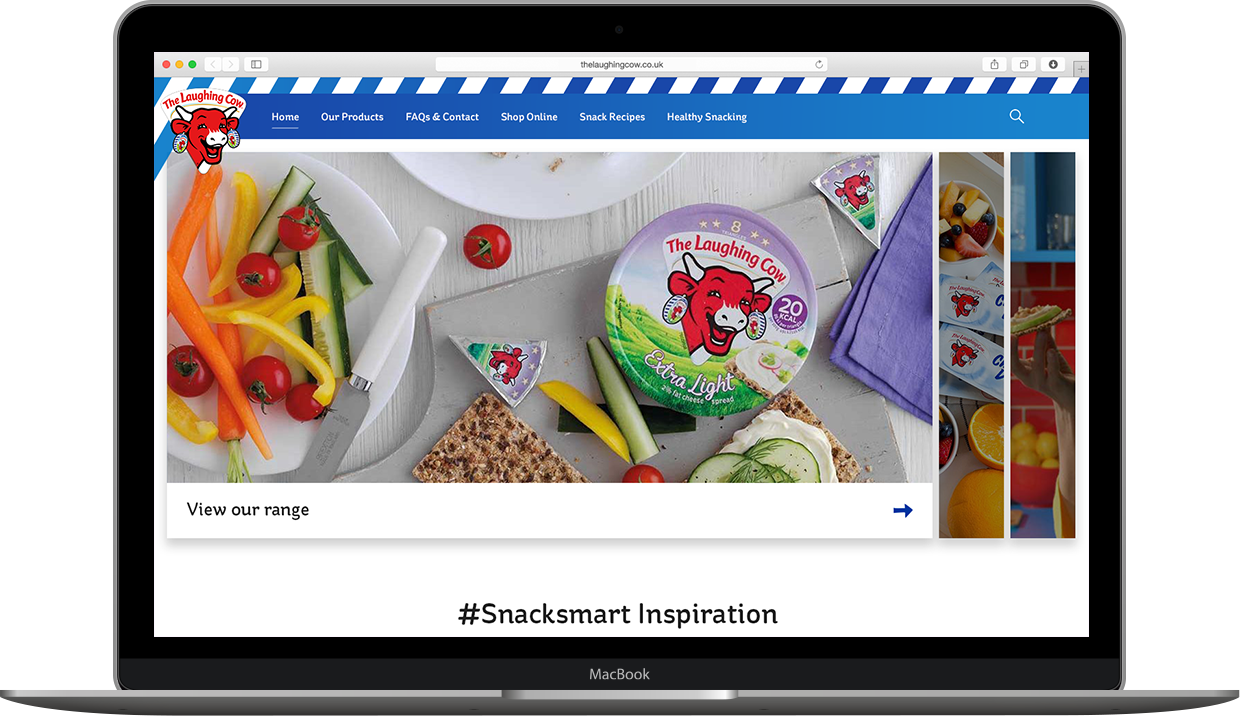
In an attempt to move away from the outdated carousel, there was an opportunity to create an adaptable header depending on the content that is available.
Currently, the website allows for three headings to be displayed within a carousel. The issue with this approach is that the users are not interacting with this and are missing out on content.
To solve this problem, the concept focused on providing better interactions and indications to the user that there is more content available.
There were two crucial behaviours to consider. Firstly, The Laughing Cow is managed by a CMS which is also used for three other cheese brands. The challenge was to create a header which can incorporate the branding used for the respective websites. Secondly, there could be between 1-3 pieces of content to be displayed. The design would need to take this into consideration. Initial concepts were not suited to all four brands and needed to be adjusted.
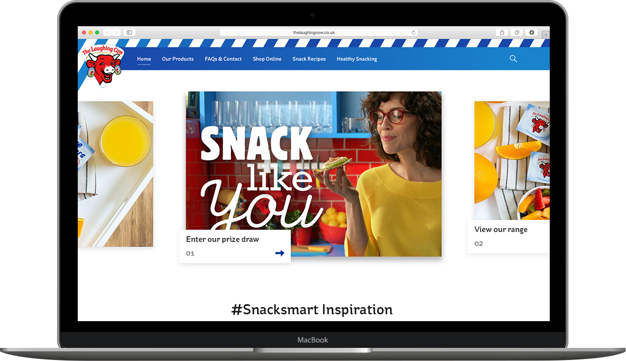
After some iterations, the final version was suitable for all four brands.
One header would be open when the page is loaded displaying a banner with the title. The remaining headers would be collapsed. Users can hover over an image which would collapse the current active header and open the hovered state. This approach increased the curiosity of users as all the content was made visible.
The design was also dynamic which previous iterations struggled with. This meant the CMS could display one main header on its own or show three versions and the design would not break.