A leading distributor in Electrical & Industrial components, my role as a UX Consultant was to analyse, design and document solutions for the desktop and mobile website during a three month contract. RS Components currently operate with a separate desktop and mobile website where the experiences are different which doesn’t follow best practice.
During this time, the three areas I worked on were;
Mobile designs
Responsive Header & Footer
Creating a UI Library
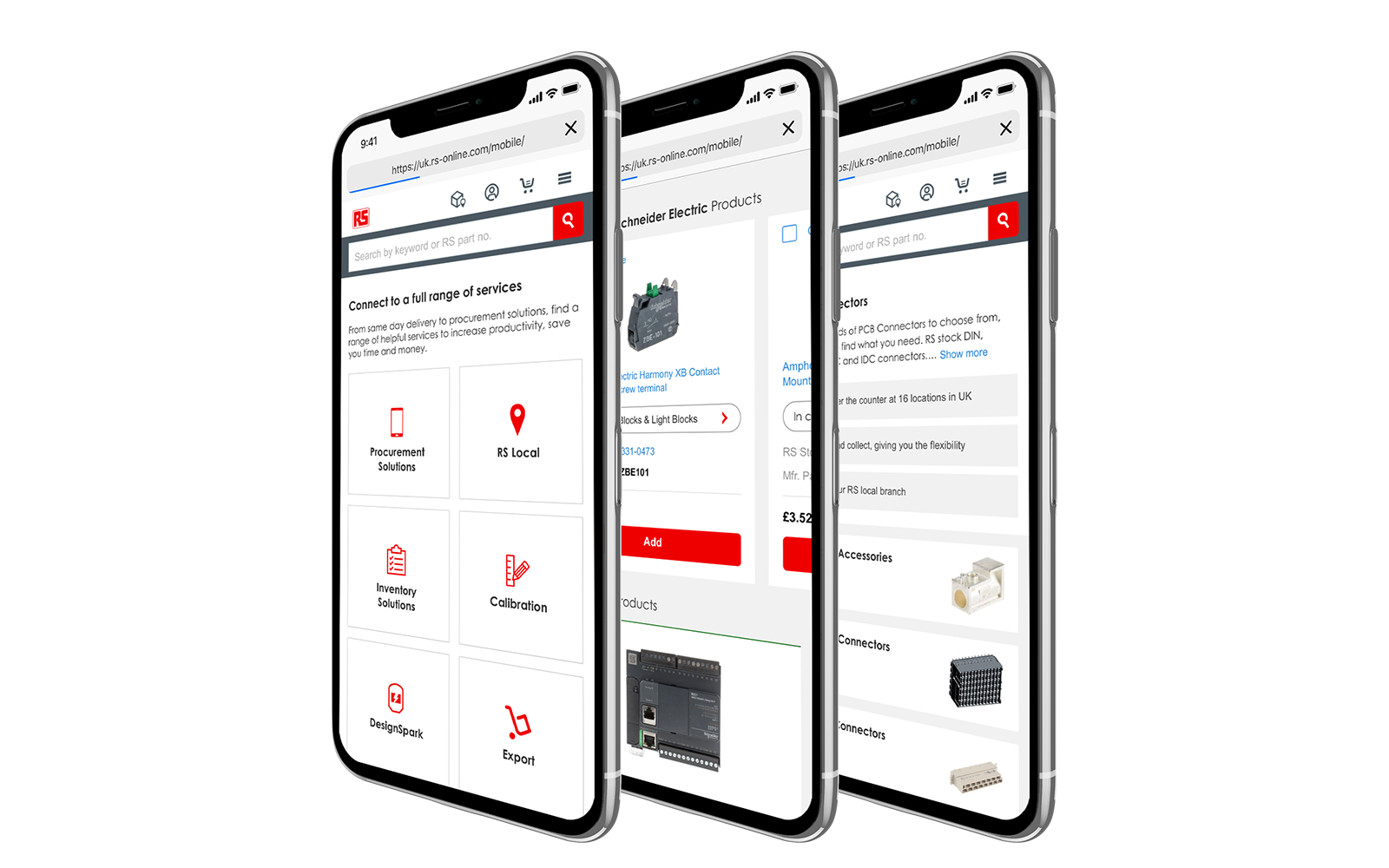
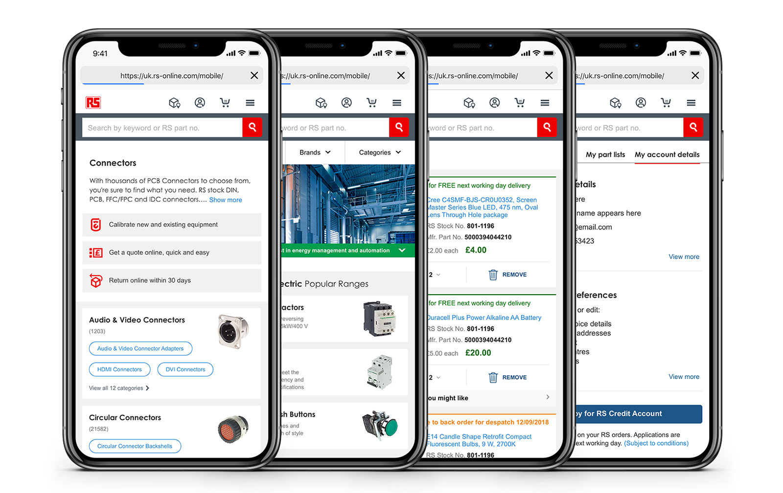
The main area of focus was to transform desktop designs which had been through research, design and user testing into mobile designs. Despite the technology used, all designs were created with a responsive approach which would help replicate the experience on both mobile and desktop.
Throughout this process, suggestions were made to help create a better mobile experience as not everything displayed on desktop needed to be displayed on mobile in the same way. After each project, the flows were documented and handed over to the UX Lead, Product Owner and Development team. Four projects were completed during this time, these were;
Browse
Brands
Basket
My Account
A new design was created for the basket checkout process on desktop. To provide the best experience on mobile, the flow needed to be altered.
To kick off this project, user flows were created. By conducting this task, the focus was placed on establishing how a user would complete a checkout process. The outcome of this task was used to create initial designs with the intention of adapting components from desktop to mobile.
The flow was split into four stages; checkout, selecting between delivery or collection, payment and additional notes. A progress bar was implemented to indicate to the user their status throughout the task. This would give them a sense of accomplishment every time they completed a section. The header was also changed to stop users from being distracted and help them focus on completing their main goal.
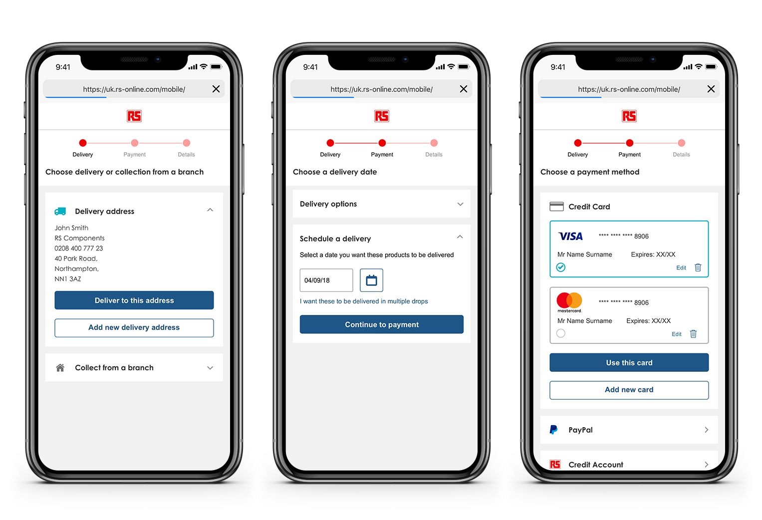
If an address is saved, this will be preselected. The user would need to confirm to deliver to this address or select another option. If a user decides to have an order delivered, they can have choose from a next day delivery or schedule a date. Any saved payment methods are displayed and preselected. The user can add another card or choose an alternative method.
When this was tested, it was evident that certain components would not work on mobile and would need to be adapted. These issues only occurred on the checkout page with the feedback for the rest of the flow being positive.
Research stated that certain products were prone to being purchased in bulk orders. Specific products also had to be purchased in grouped numbers which meant there would need to be input validation for these products. Taking this into account, the solution was to create a dropdown list providing the options of 1-9. If the user required 10 or more items, this would open up the native keyboard.
A banner is displayed when there is an accessory available to purchase for a product. This creates a dropdown within the card when selected. On desktop, this worked well as there was a lot more space to display the items whereas on mobile the space is limited and the interaction was not intuitive. The solution was to display this with an overlay.
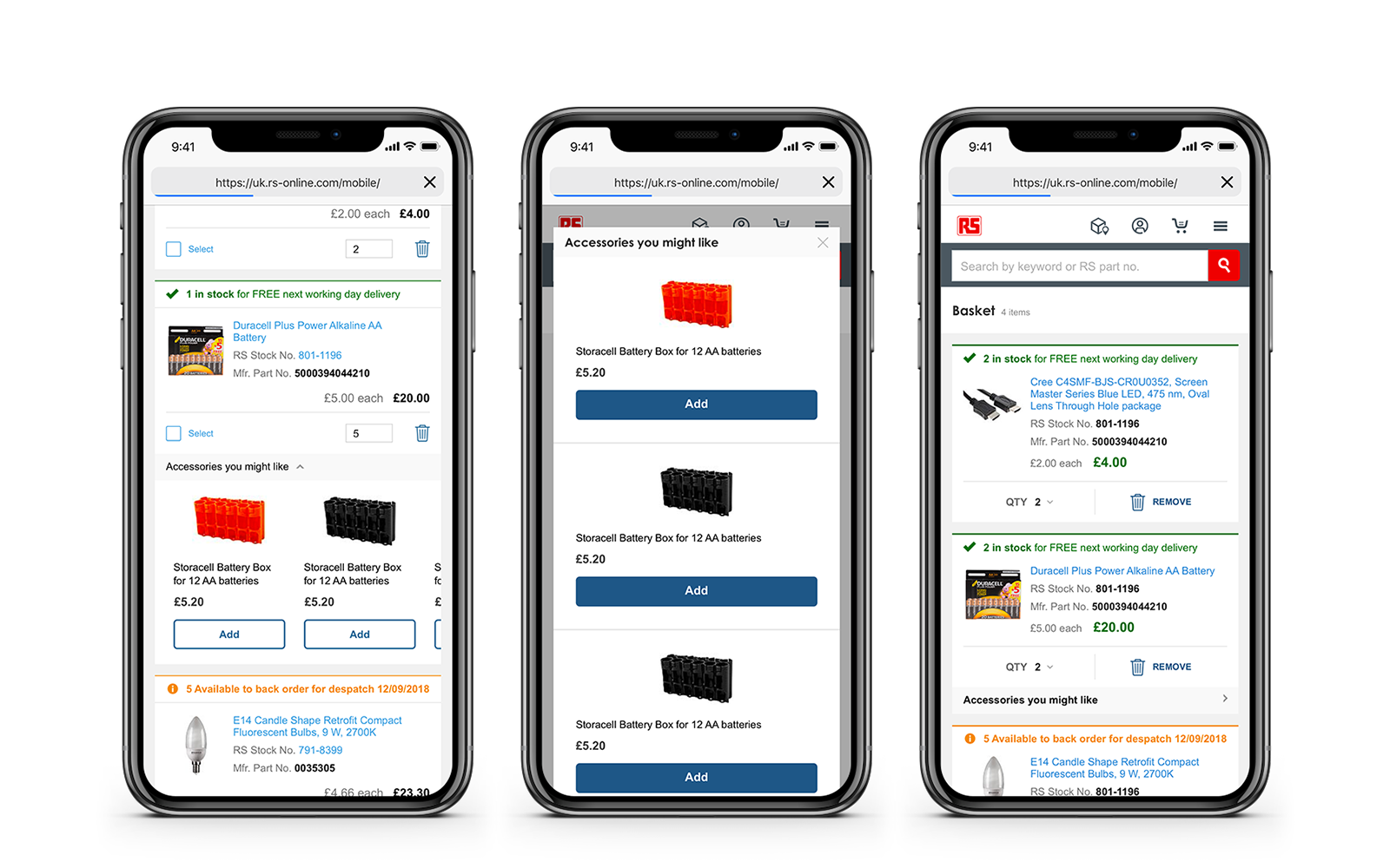
The concept of the scrolling carousel within a dropdown card did not translate well across from desktop to mobile. The concept changed into an overlay. The ‘select’ button was removed as it was not user friendly on mobile.
A suggestion was made to be explore the header and footer. Currently, the experience on both desktop and mobile is not following best practice and is something that needed to be addressed.
The mobile website utilises a hamburger menu. This icon hides all the products from the user. On desktop, ‘My Account’ features were split into two sections which makes it difficult for users to know where to look. This was one issue among other areas of concern.
A workshop was conducted where we discussed the current business goals and if there were any technical constraints that needed to be considered. The conclusion from this workshop was to create an MVP.
Wireframes were created exploring different approaches which could be used. As the brand is localised for many different markets, this was something which needed to be considered.
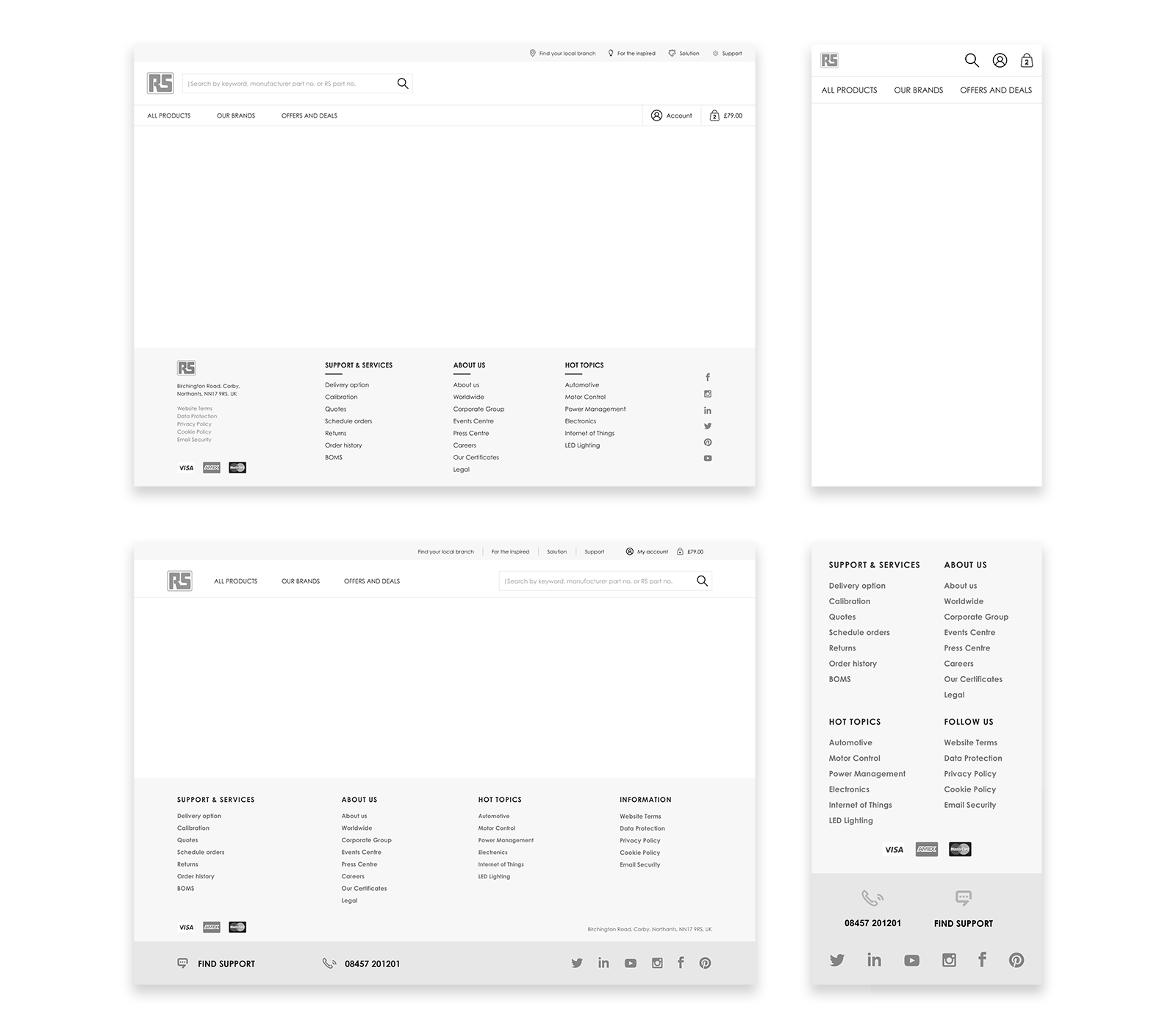
Once an approach was agreed upon, designs were created and presented. This approach had more flexibility when considering the use for global markets due to the length of labels in other languages. The header was essentially split into three sections.
1 - Main navigation links were separated from the users account and basket. This keeps the personal data away from business information as they are two separate functions and should not be combined.
2 - The search bar is kept on a line by itself which allows users to complete this action without distractions. A filter was also added to the search bar as an MVP requirement.
3 - Marketing links are kept separate from the main navigation. These are secondary links which do not help the user complete their main goal which is to purchase products.
The label ‘Login/Register’ was added to the ‘My Account’ which would change to the users name if they logged in. Legal links were placed under a section called ‘Information’ within the footer which would be required on all global markets creating a balanced design.
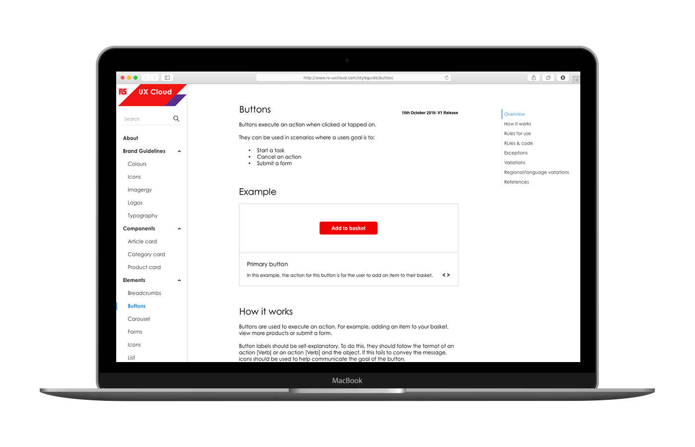
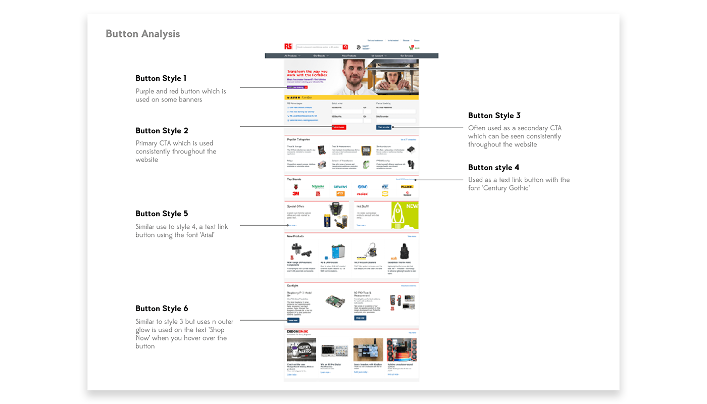
An area of concern was the lack of consistency throughout the website. This was noticeable due to the inconsistent uses of components. In order to understand the complexity of the problem, I conducted a visual audit where four of the key pages were analysed. The conclusion of this showed that there are several button styles all of which have slight variations and an inconsistent use of colours and typography.
Currently, RS Components have a basic guide explaining the use of some elements but this is limited. After discussions with the design and development team, it was agreed that a single source of truth was needed. The solution for this would be to create a UI Library whereby components, patterns and principles would be defined.
A workshop was setup with a clear agenda on how to approach the project. The first stage was to define who the core users of the library will be. The result of this stated that this would not just be used by the design and development team but also by the marketing, advertising and branding teams.
After defining the users, the next stage was to define what purpose they would need it for and what output they would expect. This included; defining the component, referencing the code and understanding the rules for use.
Taking this into consideration, I needed to understand the full process used by RS Components which was explained to me. I found this helpful as I could create user journeys to understand when a user would need to refer to the library and what they would expect as an output.
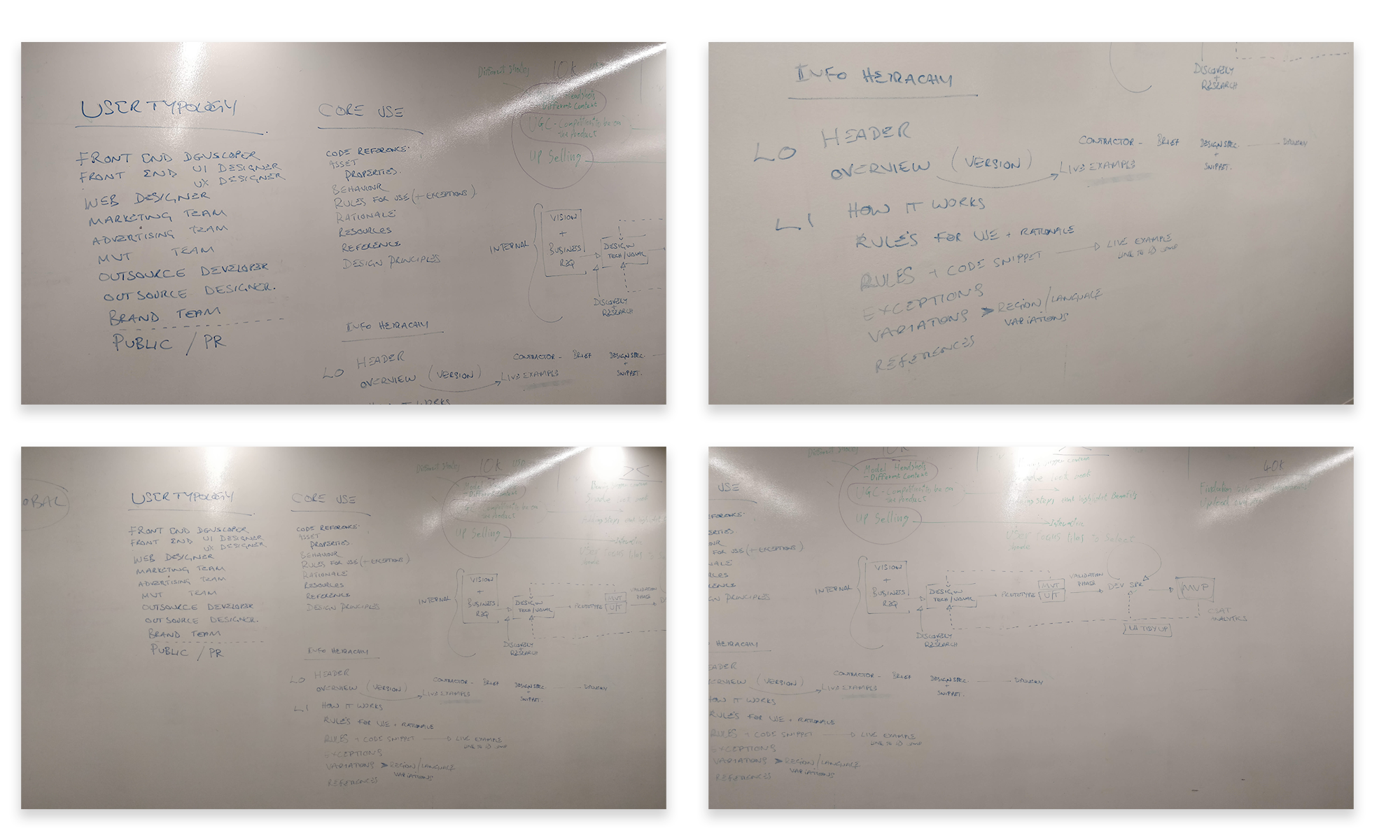
To create consistency throughout the project, the tools suggested to be used, but not limited to, were a Sketch and a React Library. As Sketch is the most used tool by the design team, this was deemed the most appropriate to use. A React Library was considered the best way for the development team to work. This would be the foundation of the library with the main body of work being the documentation which would be used to create the repository. This followed the structure:
Overview - A summary of the component
Example - An example of what the component looks like
How it works - A verbal definition explaining how it should be used
Rules for use - A visual definition of how it should look
Rules & code - Examples of when a component should be used
Exceptions - Cases where the component is used in a different manner
Variations - Cases where the component can be altered
Regional/language variations - Examples where the component is defined to look a certain way for a specific region/language
References - Examples of where a component has been used within other industries